Persona // Building Persona's Product-Led Growth (PLG) strategy with a Growth Design Toolkit
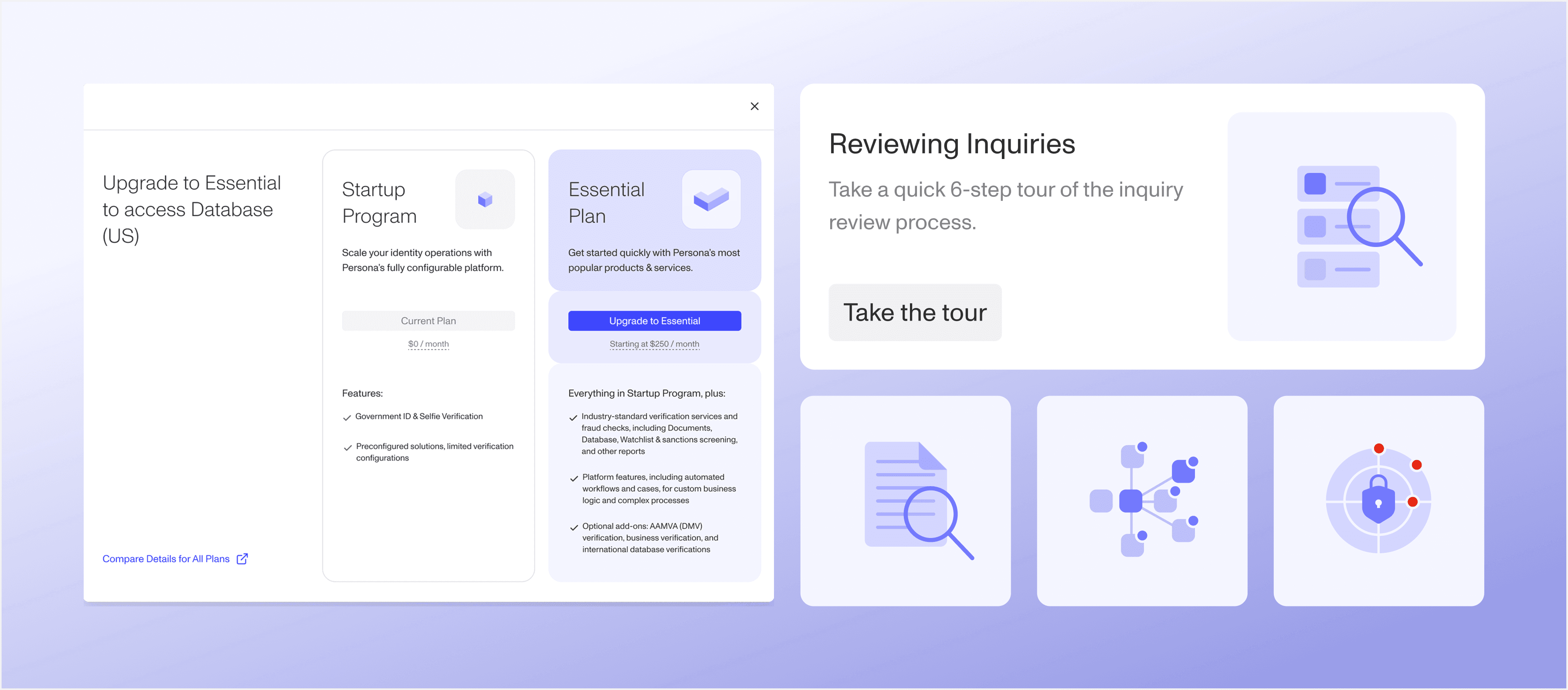
Growth at Persona doesn't have dedicated design support. This leads to inconsistent, unoptimized touchpoints across a $6M annualized pipeline, where users struggle with product awareness, discoverability, and education.
I created a growth design toolkit with reusable components — including product tours, growth cards, feature gating patterns, an illustration bank and a revamped self-serve flow — to establish a consistent design language, improve in-product education, and make upsell opportunities clearer. This work laid the foundation for a scalable, user-centered PLG strategy at Persona.
The Brief // Create a scalable design system for growth touchpoints throughout the Persona product.
Growth design at Persona is democratized across product teams. This leaves the implementation of growth strategies up to individual contributors on siloed teams, resulting in an increasing pile-up of inconsistent growth touchpoints.
Pain Points // Understanding, discoverability, and demand.
“Customers use different words, not AAMVA verification.”
Pain Point 001 // Persona has an understanding problem: most users don't speak the same language as our team and product. No one asks for “AAMVA verification”, they say, “I want to verify driver's licenses.”, which creates a critical gap in understanding between key users and the services they may need.
“When I used Persona at [my last company], we didn't know what options we had”
Pain Point 002 // Persona also has a discoverability issue. A lot of users don't know what is available to them. This is similar to the previous pain point, but is not an issue with presentation, but where content is available, highlighting our need to improve feature discoverability and socialization.
“Customers aren't going to increase their monthly spend just because something looks good.”
Pain Point 003 // In the space of compliance, trust, and safety, and fraud prevention, customer demand is largely driven by external requirements and regulations. This makes it harder to increase client spend, and ultimately requires new features to prove valuable to the specific use case of users.
Buyer's Mental Model // Several boxes need to be checked before making a purchase.
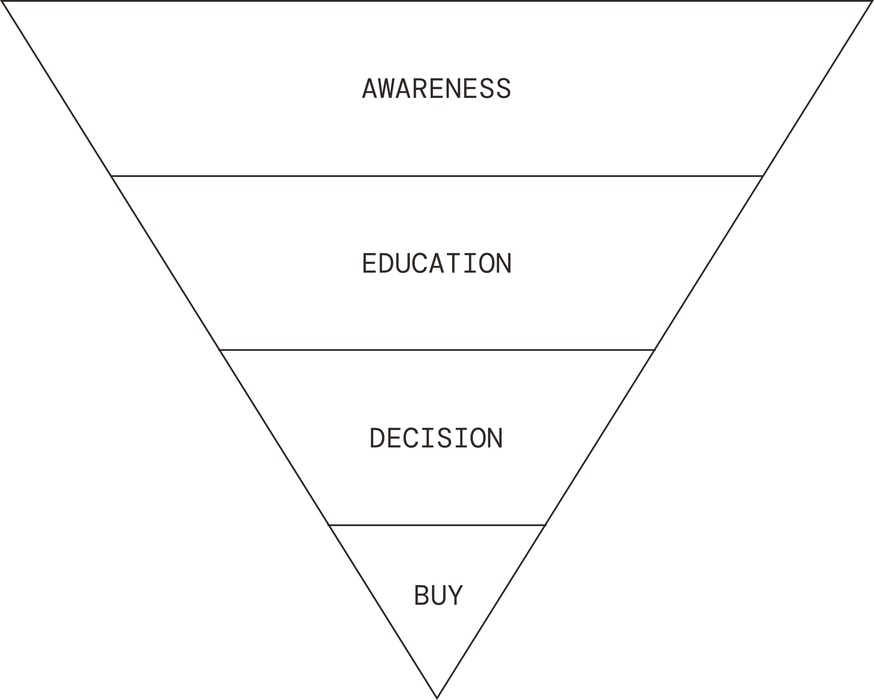
The funnel begins with the user's awareness of their options — both what they currently have and what they could purchase — and then moves into education. Through education, users need to develop genuine conviction in the value of a feature for their specific use case. From there, users enter a stage, where they decision on whether to purchase the feature. Our goal is to make their path towards attaining the feature as simple as possible.
Current Designs // Existing touchpoints only addresses awareness and purchasing.
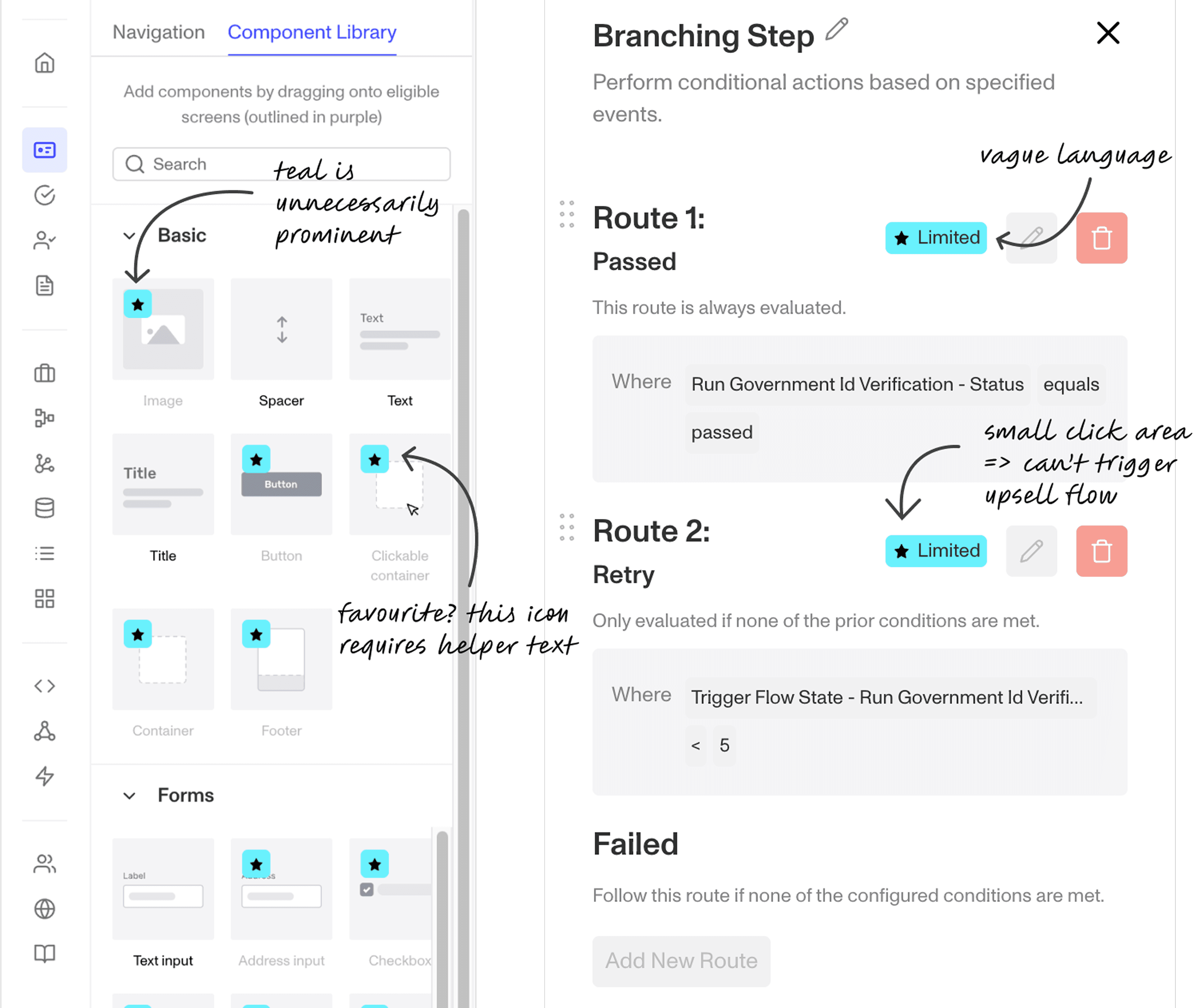
The teal ‘limited’ badge communicates the user's access to a given feature, but it doesn't help them understand what it does and lacks a clear actionable next step.
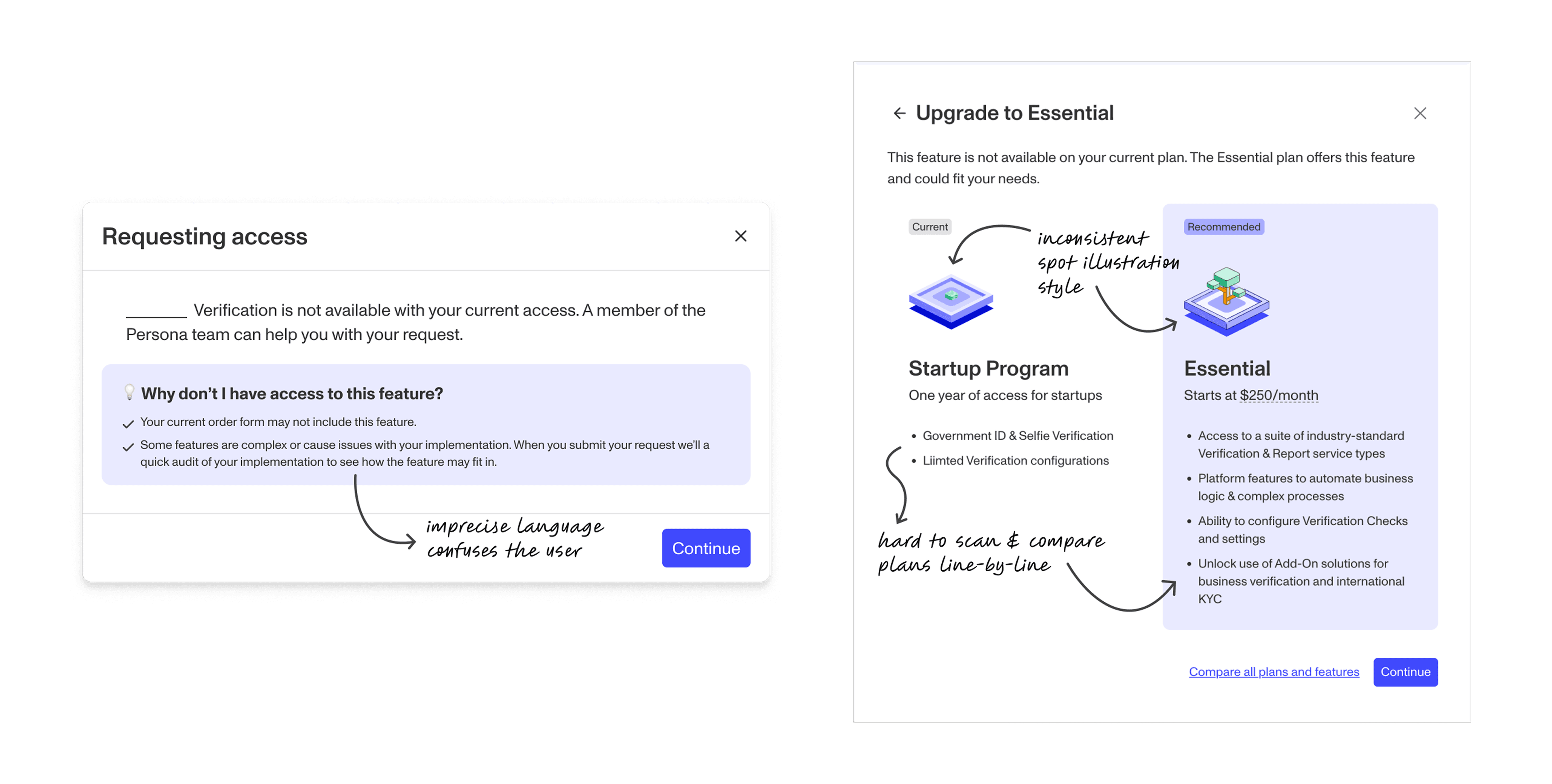
The self-serve flow leads users to purchasing, but has unecessary friction points and dead ends that lead to drop off. It also has limited portability since it can only be triggered by an active CTA or a clickable parent container.
Defining Success // The solution needs to be woven throughout the product.
The challenge is that users' needs vary, and they engage with features at different stages of the funnel. Rather than a single flow or branching path, the solution needs to be woven throughout the product — surfacing value over time, slowly winning users over and engaging with them when they're ready.
Goal 001 // Improve Awareness. Clearly show users what they do and don't have access to, while socializing other useful parts of the product.
Goal 002 // Improve Education. Teach users how features benefit them and build genuine conviction in the value of the features.
Goal 003 // Expand Growth Touchpoints. Ensure growth design elements across the product cover every phase of the expansion funnel, such that users always have access to a growth touchpoint.
The Solution // 1 solution, 5 tools
The growth design toolkit includes product tours, growth cards, an illustration bank, feature gating and an improved self-serve flow, that the growth team can apply across different product areas. I created components and rule sets for their application, allowing the team to stay mobile and work on the fly while remaining grounded in a consistent visual design language.
Product Tours
Created a product tour design system as the go-to tool for in-product education, as it explains features and updates within the context of the app.
Growth Cards
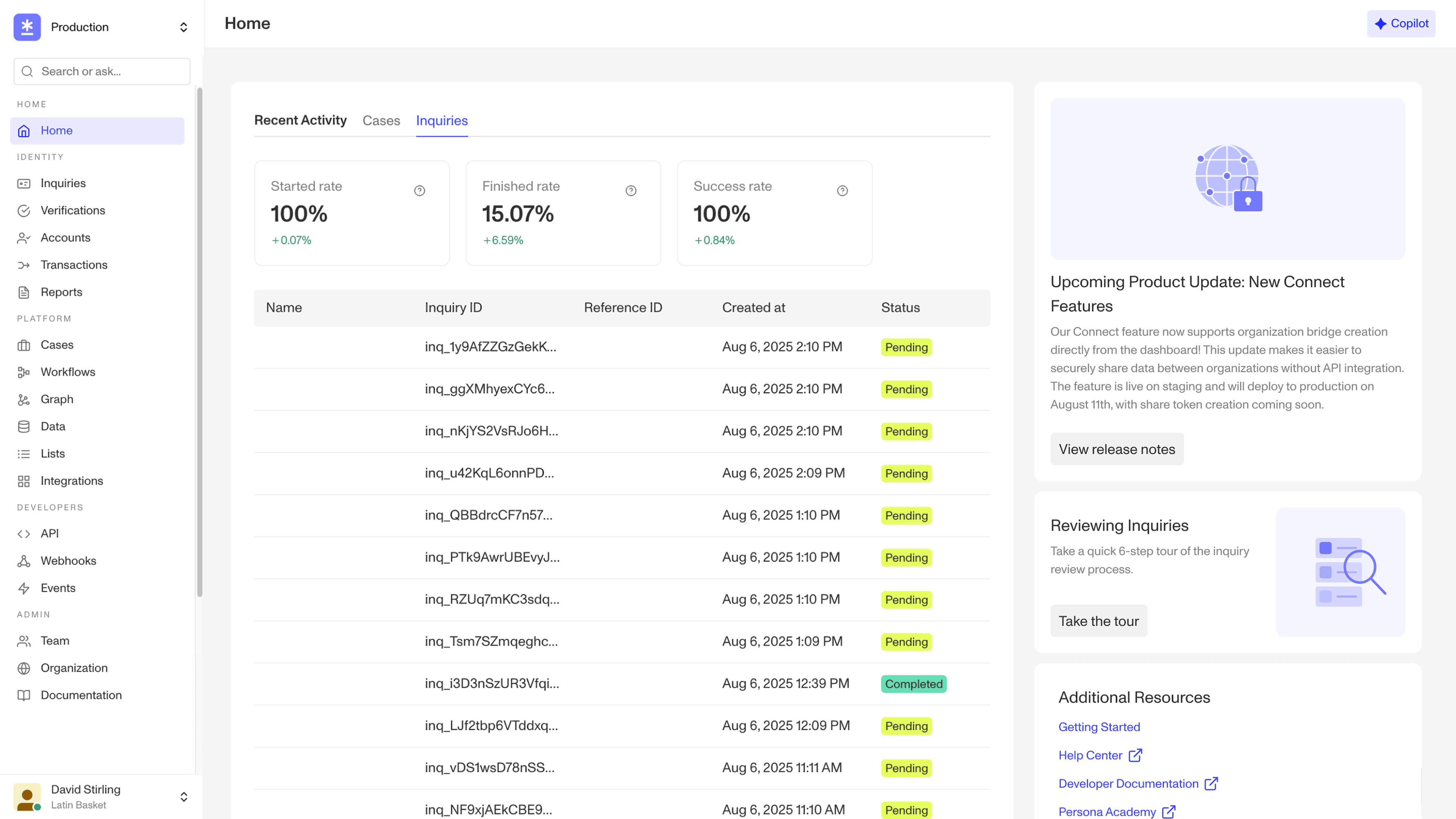
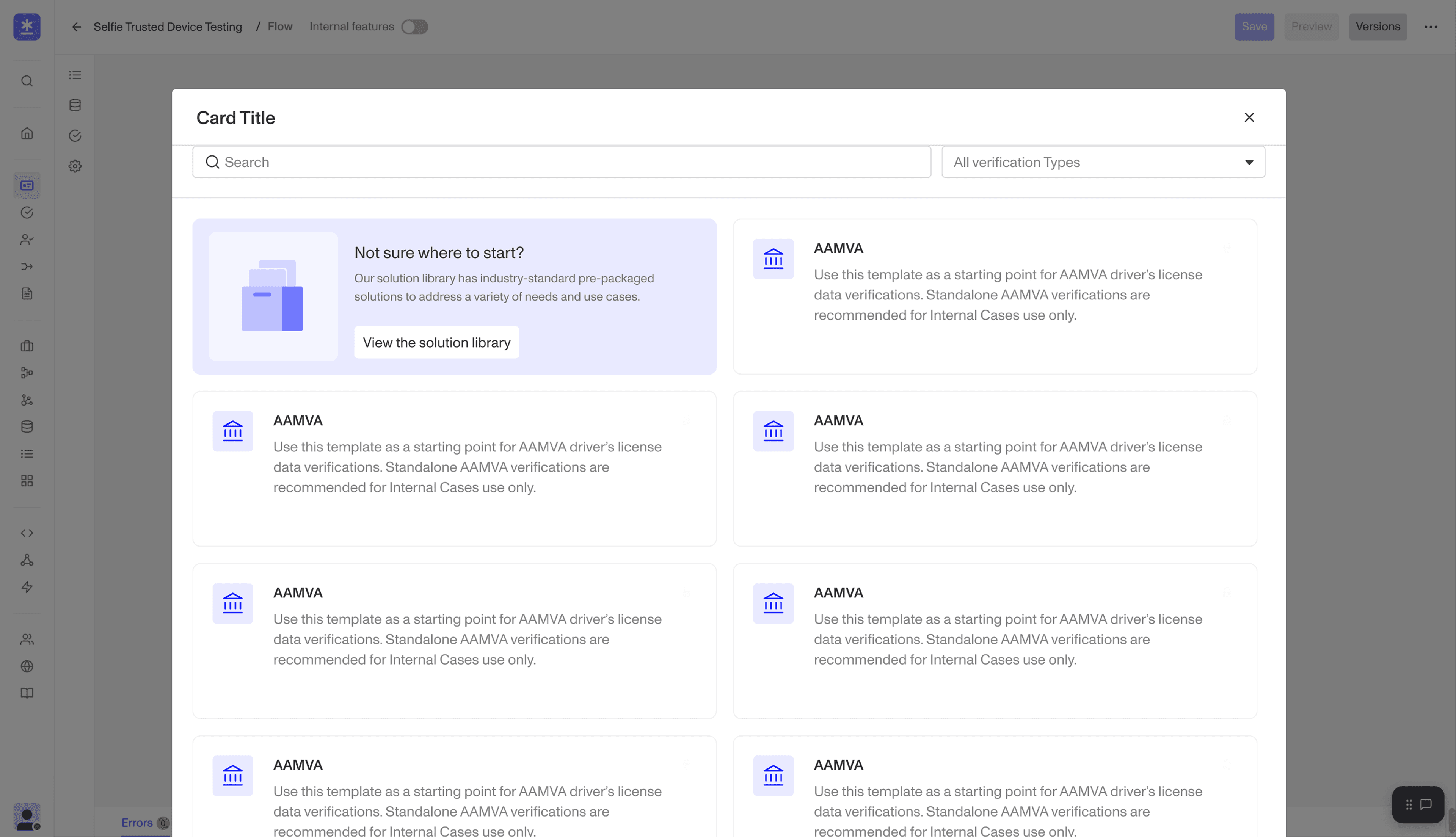
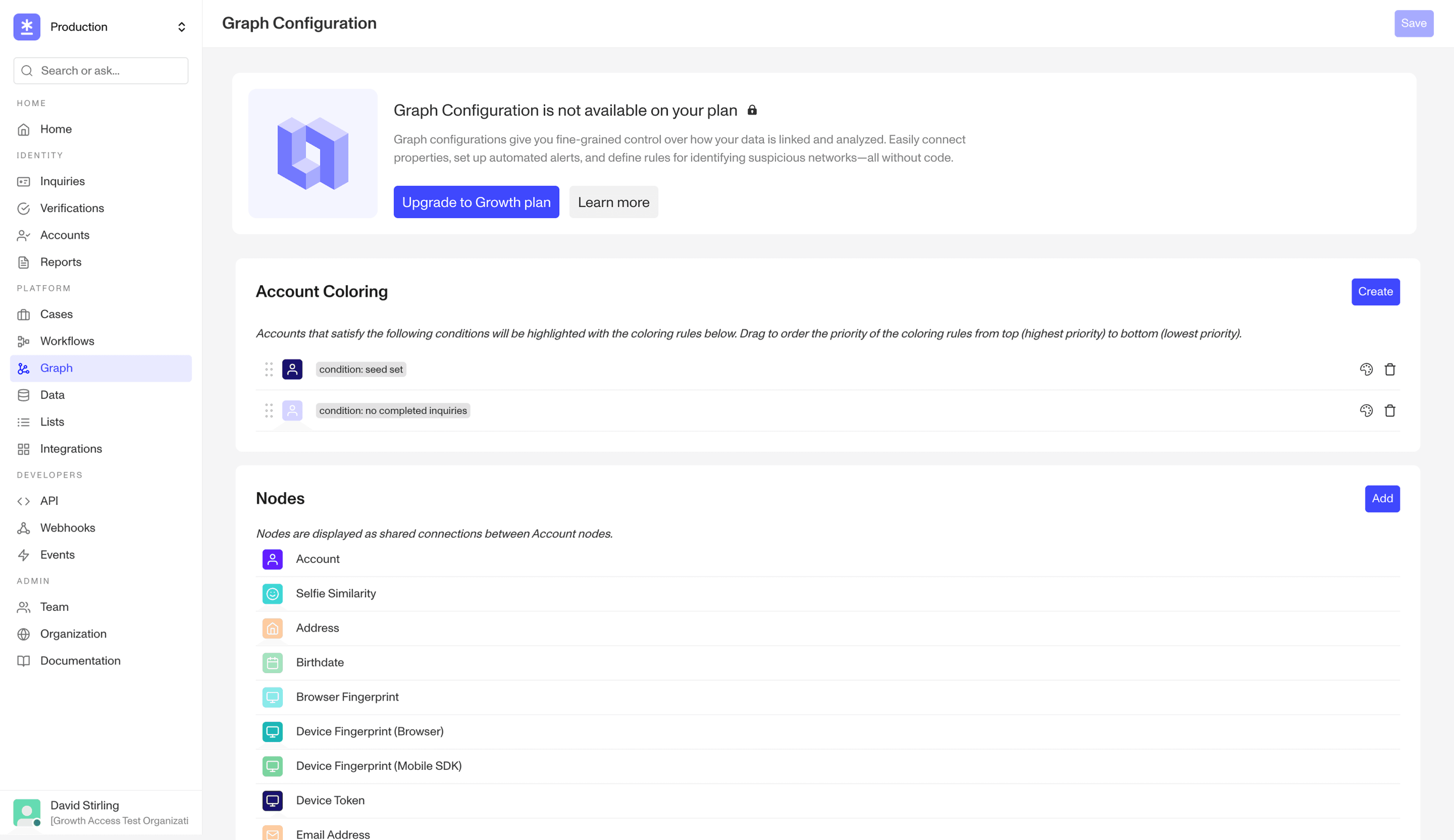
Created an embedded card style to socialize information and resources within the product, linking product tours, help centre articles and product release notes.
Illustration Bank
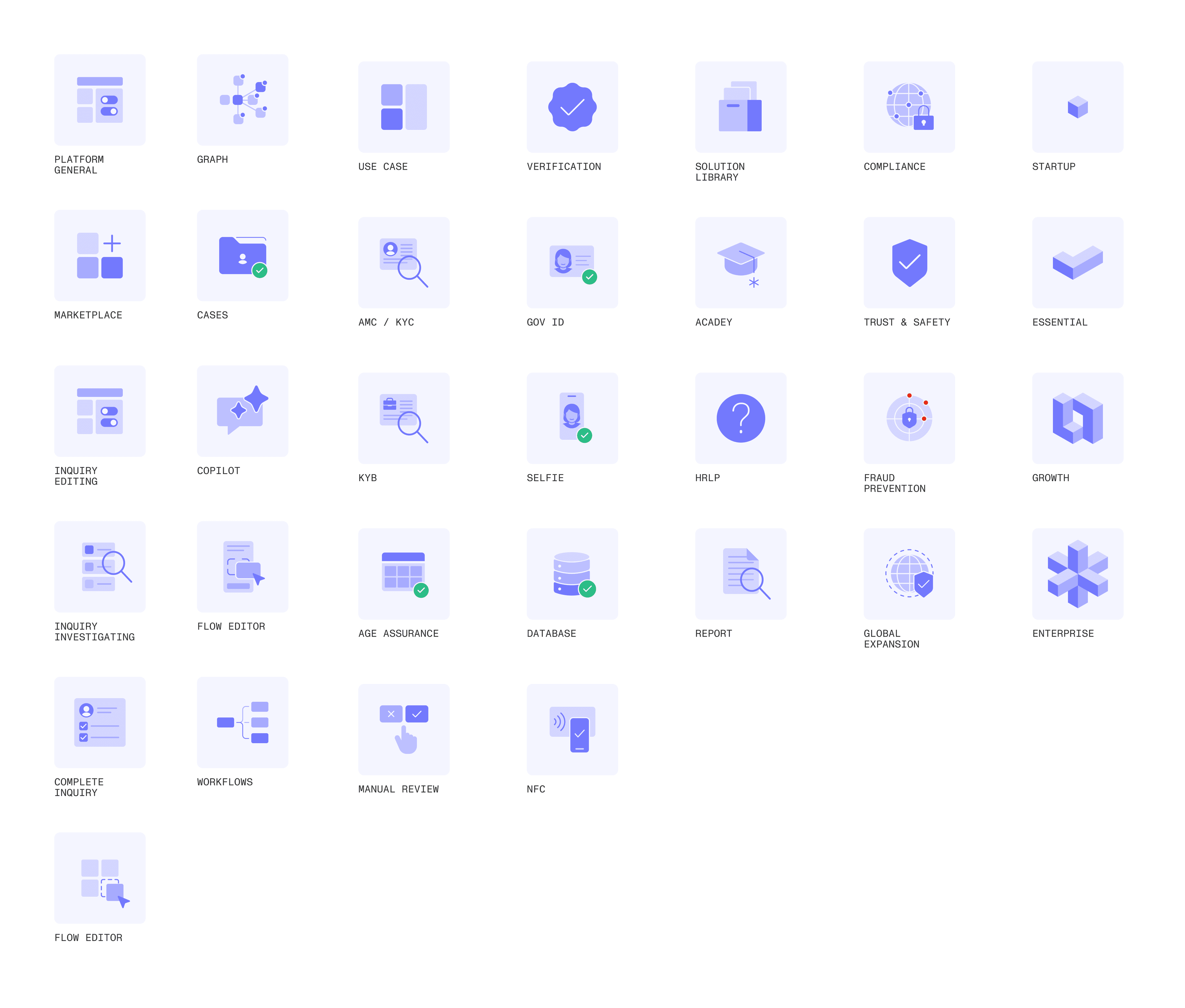
Created an illustration bank for the growth team to use in conjunction with the growth cards, working closely with our Brand team to update existing work and revamp our plan illustrations.
Feature Gating
Redesigned how gated features are presented, making limited access clear while balancing upsell opportunities and overall visual hierarchy.
Self-Serve Flow
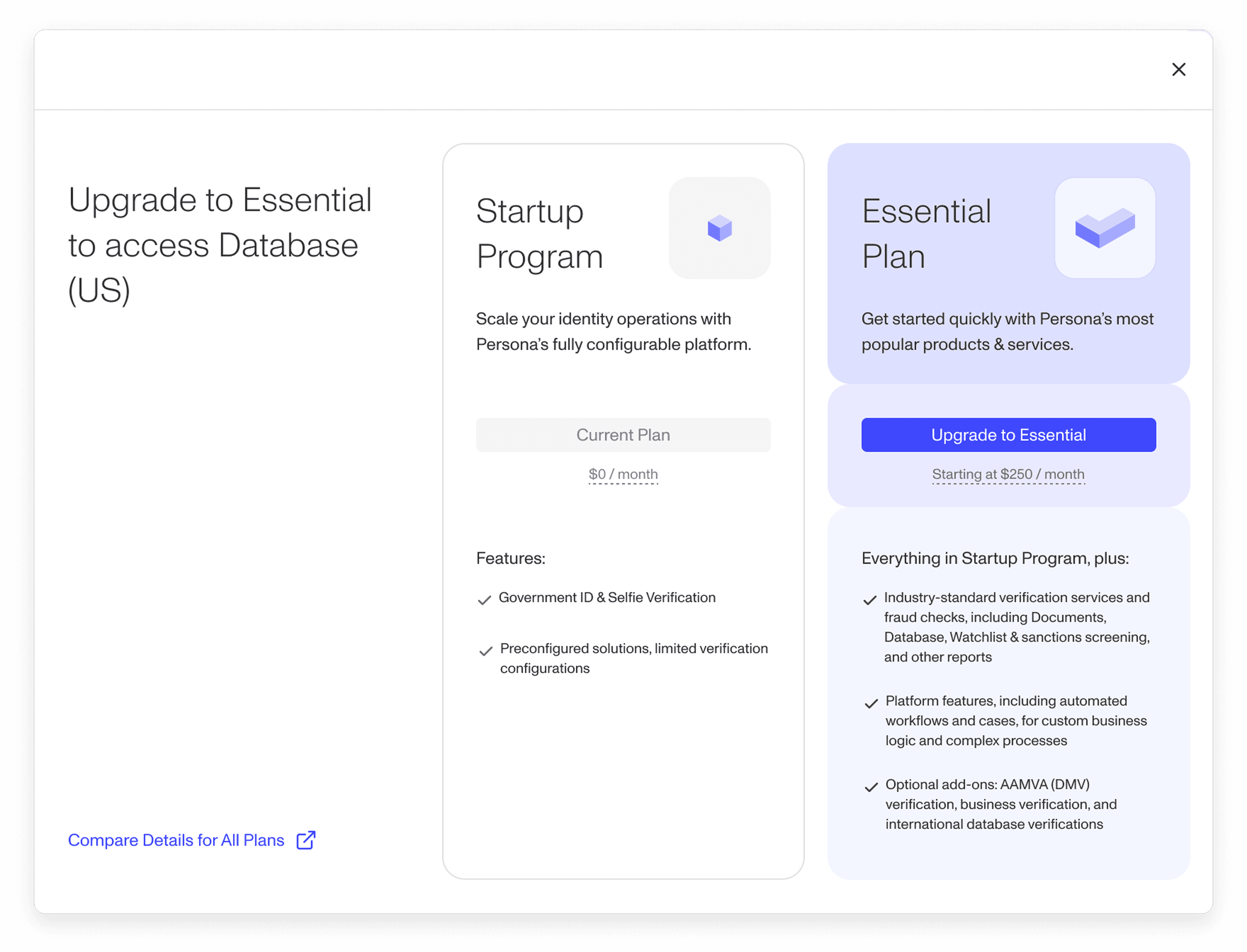
Reworked the self-serve flow to improve plan value propositions, content writing and cut out high-friction steps.
Reflection // What I would do with more time & key learning
What I would do with more time // With more time, I'd overhaul Persona’s solution library. This tool lets users add out-of-the-box solutions to their implementation, lowering the education bar. It pairs naturally with my efforts to improve in-product education. Clever design and content writing can only go so far; the solution library is where we can bridge the gap between learning and doing.
Key learning // One of my biggest takeaways was how to present designs for feedback and navigate varying perspectives. Feedback is invaluable, but it must be contextualized by understanding who it's coming from and through what lens. I learned to filter input through the specific problem I was solving, using it to critically inform the next iteration.